You now have the basic outline of a map ready for you to play with in ArcMap. This is where it gets cool. Now we can start using the real functions of ArcMap to display information on the map so you have a visual representation of your data.
First of all, a recap of what we’re going to do:
- Prepare our data: ArcMap can be tricksy if your data isn’t properly organised and formatted so it’s worth sorting that out first.
- Import the data into ArcMap.
- Join the data to the country outline shapefile.
- Export the joined data and shapefile as a new shapefile.
- Display the data.
Prepare the data
To demonstrate I’ll be using some nonsense data about the number of unicorns in each county of Britain, but if you’ve been following along using a different country and your own data then carry on with that. If you want to make your own nonsense data then this site will generate you some random data. Select CSV (basically Excel) as your Result Type and number range as your Data Type.
When we downloaded the country outline of the UK, we downloaded three shapefiles of different administrative levels, called 0, 1 and 2.
- Administrative level 0 is the outline of the whole of the UK.
- Administrative level 1 is the outline of the countries within the UK – England, Scotland, Wales and Northern Ireland.
- Administrative level 2 is the outline of the counties of those four countries. To keep things clear, ‘counties’ will now be referred to as adm_level2.
Our data is going to be regarding counties. In order for the data to be joined to the counties shapefile, i.e. administrative level 2, the names of the counties in the shapefile and the names of the counties in our data need to be identical. (The reason for that will become clear later).
The only way to make absolutely sure of that is to go into ArcMap and look at the attribute table of the shapefile (that’s basically the data that makes the shapefile look how it does), and check the names of the counties.
To do this open the map, which is saved at C:\How To Map\How to Map 1, or wherever you put it.
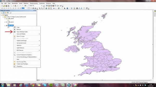
Then right-click on GBR_adm2 and select Open Attribute Table.
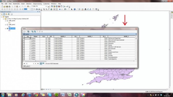
This will open a box with the attribute table in it, which should look like this.
The column called NAME_2 contains the names of all of the counties.
Unfortunately I have yet to figure out a smart way of getting those names out of ArcMap and into Excel, so usually I just copy them out. Luckily for you wondermonkeys, if you’re going to be using the UK unicorn distribution data I’ve cooked up or even just the UK for your country, I’ve already done that for you! Click here to get the data.
As I mentioned, ArcMap can be tricksy if your data isn’t properly formatted and so on. The Unicorn Distribution data set we’re using is fairly simple so not all of these points will be applicable, but here are some things you need to think about when preparing your data:
- The title of each column must not exceed 14 characters. The shorter the better. E.g. instead of ‘Number of Unicorns’, have ‘unic_no’.
- None of the cells of your Excel file can contain more than 256 characters.
- Make sure there are no hidden characters such as spaces or backspaces in any of the data cells.
- Anything upon which a join will be based, e.g. counties in this example, must be spelled exactly the same in ArcMap and in your Excel file.
If your data follows all of those rules, you’re ready to move on.


